Typography
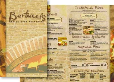
I like the idea behind the Bertuccis menu but there are a few things I would have done differently. First off, I like the idea of the oven on the front but I hate the image thats going down the side. I feel like its too much with the textured background and its unnecessary. Also I feel like the heading under Bertuccis is a bit squished on the sides, if they would have dropped it down and made it a bit larger and or change the color, I think that would have made the front of the menu better. As far as the insides go I like everything minus the pictures. They make the inside way too cluttered and they push everything out of alignment. They type itself is good I think, very original and not too formal. I like that I looks script like without being a script font. Color choices are very good, warm and rustic which I like. Overall good job there are just some small changes that I think could be done.

No comments:
Post a Comment