Wednesday, November 28, 2012

Cretech Industries

CGR 115


This flyer is a bit plain but still has some good qualities about it. I feel like the contact information could be a but smaller, its kind of distracting. I do like the buildings that are faded in the background. II'm not sure I'm sold on the font under "Cretech Industries". I feel like it it wasn't italics then I would like it better, I do like that its bold though. I think that compositionally its great, everything lines up and the information is organized. A few things could be fixed, but otherwise its good.

Blue Moon

CGR 115


This is a flyer for an opened mic night, I like mostly everything about it minus the photo of the guy in the background. I like that they used different shades of blue and the moon in the in the middle of the title. The hierarchy is good and every things in order. The spacing is nice all over the flyer and the font is also very nice. I like how the bottom of the flyer is lighter then the top but I feel if they were going to do that then they should have made the light blue text a slightly darker blue as to wouldn't fade into the background as much. Overall, good job!

Fork

CGR 115


I really like the black and white aspect of this ad. Its not the image I mind as much as the font. Its like the font is trying to be classy but instead it loos like a font for a best seller. I think the two forks at the bottom are poorly placed , it makes the text split weird at the bottom. I also think the logo should be dropped down away from the body copy, its way too close. Needs work.

Need Help Funding


CGR 115


Another good ad. I like the change in color scheme, the red is very vibrant and really makes the ad pop. I really like the telephone image at the top and I like that they are not all the same length that makes it a little less static. I like that they used the red to make their important information stand out. It feels a little weird to have the red box coming off the side with the text right next to it. I understand that they are trying to get rid of some awkward negative space but it just feels a bit forced.

Talent

CGR 115


I keep coming across ads that I don't really have any complaints about. This is another example of that. I like the blue color scheme. Blue is very popular with a lot of people and in attributed to making a lot of ads very successful. This ad is very organizedI like that they have a wavy blue area at the top and the bottom and that they are different sizes. I think the photos they chose are very nice as well. There logo is in a good place and its big enough where you can see it but not so big its distracting. The font again is very simple because it is a business ad and clarity is key. Good Job!

Simplifying It


CGR 115


I like when you can see different variations of an ad. I think they are all pretty great for a few reasons. Number one I like the colors , I really like the combination of the blue and the green together. They are very cool, calm, relaxing colors. I like that the boxes are not split evenly and I liked that there is a curved edge on the boxes as well. I like that they use an upper case font for "it" to make it stand out. The rest of the font is nice as well, very readable and looks very clean cut. Good Job.

Digitalday


CGR 115


This is such a cute ad. I like how even though there are cute dogs in this ad there are still some nice design qualities going on. I like that they kept the background a classy neutral color. I also like that they  didn't use the common cut dog, they went for a bread that doesn't come across so cute. I also like the way the dogs are positioned. The biggest dog has a great diagonal line happening in the way his body is positioned. It keeps your eye moving. I like that the information is central because there is so much movement in the photo. I really like the simplicity of the font as well and that the website is dropped a bit lower then the rest of the information. Good Job!! 

Magazine Ad

CGR 115


There are some successful things about this ad and there are some not so successful things about it. The photos are very tastefully done. I think they could have gone without the background photo too. I like how they have information centered and off to the side as well. I wish they would have put the contact information across the bottom in a line instead of on top of each other. The font is a bit to script like for my taste but I do think they should have a script font, just more readable. The brownish red background makes this ad very warm and inviting. 

Whole Foods

CGR 115


The Whole Foods logo is really professional looking. I like that everything is lined up and how the words are all stacked on each other instead of next to each other. I think it was a nice touch to have market in white letters on a green background, it breaks up the logo. I also like how they made the "O" look like a fruit with a few simple lines. I feel like the Green logo works better in this case because your talking about food and no one whats to think about black when they think about food. Good Job!

Handsfree


CGR 115


I think this is a very successful magazine ad. I love ads with a color divide, the grey at the bottom is a really good place to put a nice place to put less significant information and having the logo down there also frees up space for the important information about the product. The typography is simple and readable which matches the sleek look of the electronics. The blue background is really nice, very trusting and inviting.  

Adele 21


Typography


There are some things that I like about the back of this cover and there are some things that I don't like. I like the typography a lot, its a thinner font so all uppercase letters isn't too much. I wish that all the song titles were lined up though. I like that they have the green numbers and that they made"bonus track" green too. For the image of her I wish that they would have shown some of her neck because ii just looks like her head is floating there. I do love the dark background though. The name of the album on both sides of the Cd is nice as well. good Job!!

Nickelback


Typography


I love this band but I hate the back of this CD. I think they could have done without the name of the band on the top and just have had it on the side. I also hate the colors of the song titles. I think they should have kept it white or something more neutral. and personally I think they could have made the song titles a bit smaller and used a font not so normal. I really feel like there wasn't much thought put into this typography wise. i don't mind the photo of them in the back, I just think they should have gone with a more unique font.

Imagine Dragons


Typography


This is one of my new favorite bands and I absolutely love the cover. The typography used here is great. Its really unique without being too much. I love that the font is all upper case and that all the letters are even with one another. The slants on some of the letters are nice as well, it gives you movement within the name. I like that the first part of the "D" is missing, it gives you that separation between words. Great image, I love the smokiness of the background and the mystery is has to it. Very nice, Great job!!!

Big spring 2


Typography


So I like this label and then I don't like it. I like the color scheme much better in this one although I feel that there is way too much white. I hate the font of "nature's", it looks like the farthest font away from nature. I actually prefer the italic font under "Big Spring". I like that it flows nicely and that its not too square. I don't like the water splashes on either side of the waves, they look weird, like they are containing the waves. I think they just should have stuck with the waves and maybe made them come up a little higher. For the side information they could have made blue boxes with white font inside them, that might have helped the feeling of there being too much white. Ok job.

Big Spring

Typography


To me this water bottle label is a bit odd for a few reasons. I hate the red-orange they have going on in it. It makes me think of fall and leaves, not water. Also the text below the box is looks crushed and I have no idea what they were thinking when they used that script font for spring water. The bars going across the top and the bottom of the label are unnecessary and they make the label look cluttered. Im also not sure I like the composition. But I think an easy fix would be to move the text below the central bot to the top of it and then move the box closer to the bottom so that the text doesn't get crushed. Also lose the texture in the background, its weird.

Wine


Typography

When I look at this label I immediately think of wine. The color choice in this label is great, the olive green is my favorite. The typography is also very high class. I love the mix between script and san serif font. They chose a very thin san serif font which I like, it adds to the elegance. I like how they have where the wine is from in the green at the bottom. The fact that the text is in white really balances it out.  I don't mind that everything is central here because thats the way wine labels are, they're not suppose to be crazy. Good Job!!!

Snack Stick

Typography

These are a snack you really don't see around that much, I've never even had them but I am a fan of their label. Everything is laid out great, there are no spacing issues. I like the color scheme and that the name of the product is on a white background to make it stand out. The font is very nice and easy to read and I like the slight drop shadow they have on "stick". Doing different colors for each flavor is a nice touch and makes it easier to distinguish between flavors. I think it works to have the name of the product going horizontal and the rest of the information going vertical. It doesn't make it hard to read at all in my opinion. good Job!!

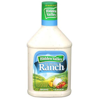
Ranch


Typography

Ranch is my favorite dressing and this label is also a favorite of mine. I love how the vanishing point in the picture isn't in the center, it closer to the bottom and off to the left side a bit. The color scheme is nice as well. I instantly think fresh when I look at this label. I like that they have the brand separated from the name of the product. I also like that the lid matches the label, it ties everything together. I like that they have the font of the product in serif font and the brand font in san serif, it makes Ranch pop. The hierarchy is nice and so is the composition. Nice Job!!

Porcupine


Typography


I feel that the front of this book cover is much more successful then the back. The image is On the front and the back is really well done, I like that its placed at the bottom of the page keeping it away from the center. I really like the font on the front but i wish they would have switched the placement of the authors name and white text. Then they could have gone a bit larger with the authors name. I'm also not sure white was the best choice for the text on the front, it gets lost, they should have done a grey. I like that the "I" in porcupine matches the line on the back of the book, nice touch. As for the back of the book, I hate the font, I don't like it being so large and I also don't like that the space at the top and the bottom of the text aren't equal. Fix the back and this book cover would be a lot stronger.

Tuesday, November 27, 2012

Gap

CGR 115


I love the Gap logo. The white lettering on the dark blue background is really nice, I'm a fan of dark colors so this logo is really good in my opinion. I also like the font. I like that its a longer font and the serifs work really well . I think it was a good choice to use all caps because it hold the space well. I feel that if it was lower case letters then the dark blue background would overwhelm the name. Good job Gap!!

Dole


CGR 115
Dole, shows us again the popularity of primary colors. I can't say I'm a fan of this logo. I really don't like the font and I hate when primary colors are being shoved down your throat. I would have either thinned out the blue line at the bottom or I would have thinned out the font. The whole logo is just too chunky for my taste.

Pure Healthy Back


CGR 115

This is a really well executed logo. It's clean and professional looking. The colors are very nice, there's color but its still business like. I like the font a lot, I like that there are thick and thin lines making up "Pure". Everything is laid out nice and everything lines up. I like the green line under "pure" but I don't like that some of the letters in healthy are cut off by it. A san serif font was a good choice, it makes the logo look more clean cut. Good Job!!

Fritos


Typography

I usually think bag designs are bad but this one has some nice qualities. I like the curved line between that separates the yellow and the brown. I like that there are different hues of yellow and brown instead of just a solid color. I like that the font has a curve to it like the food. I feel like everything is placed very nice composition wise. The diagonal positioning is also very nice. Good Job!!

I Foresaw It


Typography

So this book cover bothers me for many reasons . One, the central image in the middle is terrible. If they wanted to use that image they could have done it without the phony bubble or the super corporate image in the bubble, something just has to change with that. All the text has weird space around it, nothing lines up and I hate the yellow. The font itself isn't bad and I like the black bar at the bottom. The back of the book isn't bad either, get rid of the photo of him and the title, I wouldn't have any complaints. Fix the front and it wouldn't be that bad.

Breyers

Typography


Being a fan of ice-cream I thought I would look up one of my favorites. As you can see they have many different designs. I really like the black background in each of them. I think that both are successful but I prefer the one on the right. I like the script font and the green on the black over the pink on the black. I also like the leaf that they have over Breyer's in the left one. I like that the script font is readable and not so scripty that you loose the word. I also like how everything isn't straight on like the one on the left, I like the diagonal placement of the logo and of the picture. Good Job!!

Cheesecake Factory

Typography


The Cheese cake factory is one of my favorite restaurants and the menu is a favorite of mine as well. The font is really nice. It's very unique and I love how the "C" and "F" are so much larger then the rest of the letters. The "the" sitting on top of cheesecake is a good touch and its placed well. Its interesting that the only thing that separates the too words is the large first letters. I like the mix of all uppercase serif letters with italic font below it. Its bold mix with classy. The only thing I'm not so crazy about is the central thing they have going on.

Chips Ahoy


Typography
Chips Ahoy has a really nice design going on that every one loves. I like that they have a big in your face font. There are primary colors here which is proven to draw in kids. There is a very playful font in the yellow boxes which goes try well with the vibe of the label. The primary color here used is blue which is most peoples favorite color. The images are appetizing and the white background really makes chips ahoy pop. This is a very yummy label. Good Job!

Not the right way


Typography


I think this is a great book cover . It's type combined with image which is really nice. I like that the figure is off center and that you can't see her whole face, it kind of gives a mystical feeling. I like the font of the author much better then the font of the name of the book. I cant stand the script font used for the second half of the title. The bar going across the bottom holding the authors name is a nice design touch as well. The black background really makes the figure pop off the page. I think they could have one with a much smaller font for the title. I feel as though its a bit smushed. Good Job!!

Black Swan


Typography

This label is very high class and clean looking. Black and red was a great color scheme choice. It picks up the dark color of the wine and the red matches the top of the bottle. The script font underneath the name also adds to the class of the label. I do wish they would have made it a bit darker so it was easier to read. I also like that it the label has a white background. The lines going along the top and the bottom are also nice design touches. I think the font is also a good choice. I like that its not all uppercase because that would take away from the classy look.

Vibe


Typography


I think this a very unique drink label. I like that they have information about their brand on the side, thats a nice touch. I like the repetitive circles coming out of the corner and the color scheme is really nice and bright and fits the name of the brand.. I think that it's good they went for a bold font because of the color scheme being so light. The only complaint that I have would be to make Vibe come away from the circle a bit more because it looks a bit smushed.

Pickels


Typography

So I'm not really crazy about this pickles logo. It reminds me of christmas and thats just a turn off all together. Plus I feel like all I see is the Full sour and hot repeating themselves which is distracting. There is also a lot of weird space around the circle because they put all the information on the edges. I feel like the ounce information is also way too large. Its just very symmetrical, the colors don't work and neither does the font, it looks too high class for a pickle jar.

Iams


Typography

I think Iams is a very successful label. I love the green color scheme and the swishes that are incorporating around the dog, it gives depth to the label. I like that they have the logo going up the side of the bag and then the information across the bottom. I think that was a good choice because it gives you different angles and it keeps your eye moving. Everything is lined up nice and the font is great. The thick bubble font for the logo works well and its playful like dogs and then you have the san serif thin font which works well for informational purposes. The white type really pops off the green background.

Biodrop


Typography

So i found this water bottle label and its in half english and half Japanese. Even though I can't read all of it I like the shape and the color blue they used. Compositionally I think everything is laid out nice. I like the lowercase, san serif font and I like the different variations within the font. I think its nice that they have the box with biodrop toward the bottom off centered. The image of the water also moves your eye across the label, so I like that there's movement there.

Walt Disney World


CGR 115

Oh, the famous Walt Disney logo. A logo known to every child and adult alike. Obviously, this is a very successful logo. I like how the castle is broken up into segments, but still appears to have depth because the lines get thinner as they go up. The font, even though its script-like, is still very playful and bubbly which is befitting. We usually see this logo in a dark blue shade that makes it look like night time, so you get a very mystical feeling. It is very nice, and still one of my favorites.

Conagra Foods


CGR 115


This is a pretty good logo, in my opinion. I enjoy the color scheme. The green is about two shades away from giving me a christmas feeling that I really don't like, but this combination is fine. I think the subtle design elements are nice, such as the leaf on the "R" and the bowl doubling as a face. I think they should have made "Food you love" line up with the "s" in the word "Foods" above it because as it is, it looks a bit off. The font is really clean and readable, which I like. I also think "Food you love" could come up closer to "Food' in the first one logo. The second variation of the logo is the one I prefer. I wish, again, that they would have extended "Food you love" to the end of the "s" .

Billabong


CGR 115
This is a very effective logo for a company that targets skaters, surfers, and generally a younger audience. I think they did a really good job of marketing this to their target audience. The font alone gives off a young and hip vibe. The "A" even resembles like a ramp. I like how all the letters are touching and how it's all outlined in black; it really makes the letters pop. I also like how the logo is in an all-uppercase, san serif font. Nice choice! I've seen this logo in several different colors but I prefer black and white. I like how the image on the left is physically attached to the name of the brand with no awkward, empty space. Great job!!!

Auntie Anne's


CGR 115


I think the Auntie Anne's logo okay. It's not the kind of logo that really catches my eye, but it is an effective logo and it has been for years. The things I don't like about it are the colors and the layout. I don't care for the pretzel image being above the brand name and I don't like the weird space on the sides of "pretzel perfect". I think they should have put the pretzel underneath, or to the side, of the logo (preferably on the side to get rid of some of the negative space). In this logo, the colors seem too primary to me, to the point of severe annoyance. The font looks classier than the illustration. I feel like they should change one of the two to achieve some sort of consistency. Personally, I would change the illustration because I like the font. 

Education International


CGR 115

I really like this logo because it's successful in many ways. I love how they use thick bars to represent books; that is very clever. It only works because they have one bar on a diagonal slant. The typography used here is also very nice. I like that they have "Education" as the same weight as the books. It makes it so "Education International" isn't crushed. Everything is lined up nicely and I like that they have the website URL under "Education". There are no serifs on the font which adds to the sharpness, in my opinion. Best of all, it's a black and white logo. Way to go!!

Monday, November 26, 2012

Titletown Brewing


Typography


This menu is put together really well. It feels like a very hometown menu and I like the photos they chose to use. It kind of gives you the history of the town . Its still very clean cut and laid out nice. The typography isn't crazy which adds to the clean, crisp feeling. I think the old time, aged background goes very well with the home town idea. I like that they have the headings in red to separate them from the entrees.

Pure Silk


Typography


To me this label design is a bit crowded. I think they could do without some of the advertising. But if they needed to include it all, they did a good job of making it all fit into that very narrow space. The hierarchy is done very well and the type is very effective as well. Its a very lengthy font and it as a flow to it which is nice. The orange and the blue work very well together considering they are complimentary colors, that was a good choice on their part. Overall good job, just a little cramped in my opinion.

Sushi

Typography


Some of this type is hard to see but i have to comment on it because it is one of the classiest menus I've ever seen. I love the black background and the cool and warm colors throughout it. I don't mind the picture because there is only one and its placed very tastefully off to the side in the upper right corner. Everything is lined up very nicely and the font is also really great. Its really unique which I like, I've never seen a font like this one, the tracking is very tight and I think that was a good choice. I honestly don't have any complaints with this. Great job!!!

Thai

Typography


In my opinion this menu is a bit crowded. Simple fix would be just to make it have more pages. I really like the color scheme. It has those dark colors which I like and I also like the the orange headings that match the orange in the photo. The prices are also a bit close to the entrees as well, it adds to the crowded feelings. The font is also very nice, I like the handwritten, italic font. Even though it reminds me of handwriting it still comes across classy. The white type on the dark background really pops. I also like how things are not central. Good job!!  

Menu 4


Typography


I think everything about this menu is nice except for the front cover. The middle and back page look really nice and a bit more classy then the front and that bothers me. I think they should have gone with something a little less cartoon/ illustrator like for the image. Something more like the design they have at the bottom. I feel like they could have dropped the contact information a bit lower so it wasn't so central. And the font for the title of the menu looks like jewish writing, so I get more of a bar mitzvah feeling then a classy restaurant feeling. I also like that they only use two colors and that the blue changes hues. Very nicely done, just fix the front.

Menu 3


Typography


I really like this menu. The colors are great, I love that they used different hues of orange. I don't think all the photos are necessary, I think that detracts from the beauty of the color and the type. I also think they could have done without the white boarder. I like that they have the food titles in red, it actually compliments the orange really well. I do think they could have gone with a slight left scripty font for the menu title only because it could get hard to read. The layout is really nice also, very clean and easy to read. Good job!

Vitalba


Typography


I really like a lot of things that are going on in this label. I think that the wave like effect is really nice and I like all the different color variations within it. I also like that it gives you that diagonal effect and that it keeps your eye moving. I really like the font. I think it was a good choice not to have it san serif. The logo is also really nice. The flower is a nice touch and the font fits with the flower. I like how the edge are rounded to match the petals. The type at the bottom does feel a little small, so if they wanted to make it larger they could decrease the amount of green space they have. Overall, good job and great color scheme.

Atlantic Clipper

Typography


I really hate menus that have a limited selection on what you can order, that aside this one needs help. I feel like its not clear if the right side is the front or if its an inside page. Second, whats with the spastic placement of the words on the right side. I have no idea what I'm reading, it looks totally chaotic. I do like some of their design elements such as the lines on the left page and their logo isn't too bad, neither is the typography if they were going for an old time like look. Its they layout that really sucks. I like the dark blue on the menu, not the blue boarder though. I think they should stick with the layout on the left page if they had to choose. Has potential but needs a lot of work.

Aztlan


Typography


So with this menu I kind of like it and I kind of don't. Mexican restaurants aren't usually classy and elegant so I guess it works in that regard. I like that it immediately gives you that mexican restaurant feeling and the color choice is really nice. I think the typography is right on and matches the theme really well. The tilt of the headings are kind of nice yet kinda of distracting. I don't like that the second heading down runs into the picture either. As for the front, I don't think they should have the phone number so large, its a bit distracting. I also think they shouldn't have made everything on the front so central, its boring. So some things I like and some things I think need improvement. 

Friday, November 23, 2012

Homestyle Jelly Jars

Typography 


I realize I have already done a post on jelly law labels but I came across these and they are so different then Smucker's I thought it would be nice to look at a not so popular brand. I actually think these labels are really successful. To me they are much more elegant then Smucker's. The white background of the label really makes then stand out. I think the typography is also very elegant looking. Very thin lettering, font variations and slight color changes make these labels very crisp and fresh looking. I like that there isn't a big graphic, there are just small symbols representing what flavor they are. I think that was really tastefully done.The labels being round not square also gives it a unique feeling. To me these feel like a cross between homemade and classy, but I like it. Good Job!!!!

Menu 2


Typography


I was just looking at different menus out there and I came across this one. There are some things that I like and some things that I don't like about this menu. First off I hate that all the food names are in the center. It would be so much better if they were off to the left. I get a more formal vibe from this menu with it being very linear and more plain. I don't know if I like the gradient not the sides but it does give me a kind of wine feeling which I guess goes with there theme. I think they actually did a good job with the typography, everything looks very elegant and clean. I like the different font variation as well so good job there. I don't know if I'm crazy about the menu within a menu idea. I wish they would loose those diagonal lines and just continue the maroon side bars right to the bottom. Overall and ok job, just a few thing I would fix.