Thursday, August 30, 2012

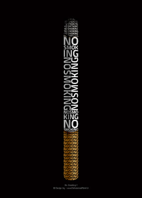
NO Smoking

Typography


I think this is a great example of typography. It combines image and text in an effective way. This is much more intriguing then a no smoking sign. Even though the lettering is small at the bottom and top it really doesn't effect the image too much because the viewer knows it says the same thing all over. Pretty good job!
Burger King

CGR 115


The Burger King logo is a great example of an effective logo. The simplicity of this logo is what makes it work. The primary colors really make this logo pop! Primary colors are colors our eye is easily drawn too. Kids especially like primary colors and if kids like something they want it and if they bug their parents to get it business gets better for that particular company. Also the simple design of the buns really works. GO BURGER KING!!

Wednesday, August 29, 2012

Carroll


CGR 115

Considering this is where I attend school I figure why not check out Carroll's logo. I think Carroll's logo is overall very good. Like may good logos it's very simple in design and color scheme. I like how the half circles imitate the C in Carroll. I also like how the two different color half circles are connected in the middle. Everyone who attends Carroll know they stress the importance of "unity" in the word community and I feel the connecting half circles symbolize that. Good job Carroll!!

Swoosh

CGR 115


Probably one of the most famous logo and design of all time. Everyone knows the Nike logo and the symbol for Nike. This shows just how effective simplicity can be. All the design is is a check mark or "swoosh". When  I look at the swoosh I think of speed and agility and I'm guessing that's what other people think too because Nike is one of the most popular shoe brands out there today. The logo is just as powerful as the design. It's short, sweet and to the point. Three little words have the power to make people go out and by Nike products. Amazing stuff.

BAD flyer


Typography


Bad example of a concert flyer. Is flyer is severely overwhelming. The colors alone are enough to make this flyer a bad time. Aside from that, all the action in the foreground takes away from the information. The names of the bands are also not very legible and the little smushed  numbering next to them doesn't help. Finally the diagonal positioning of the information just adds to the headache in this situation. This flyer needs help!

Flyer

Typography


This is a great example of a band flyer. The text and the placement of the text is done really well. I like the simple color scheme and the texture in the background. The bird in the middle of the o is also a clever choice. The imagery is not overpowering which I like and its not directly in the center which I feel makes the composition stronger.

Rules

Typography


This is a good example of type working to catch the viewers interest. When I look at this image it draws me in because its not obvious what the letters spell, you have to take a minute and think about it. I always like pieces that make me think. I also love the simple color scheme of black and white and the way the letter run off the page. Good composition!!